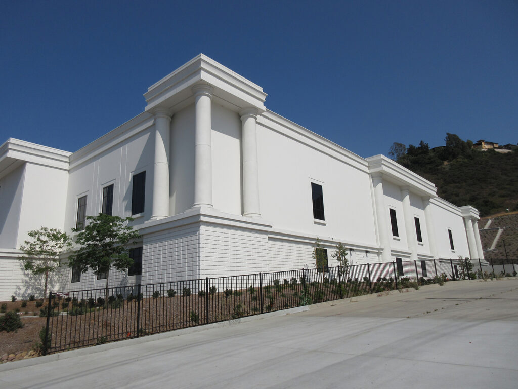
This is what happens when the designer is told to create a “classical style” building, but all they can think to do is align some rectangular windows, slap on some columns, paint everything white and call it a day. At least add a pediment over the main entry. Something. Anything!
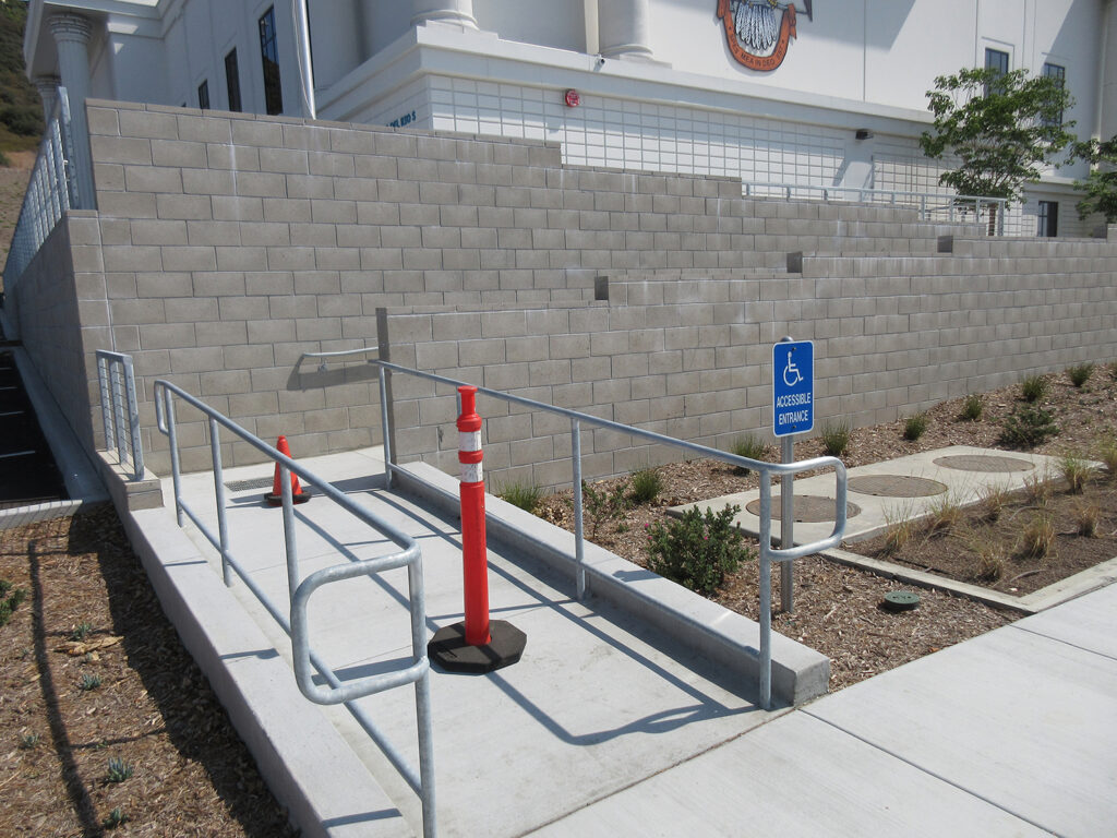
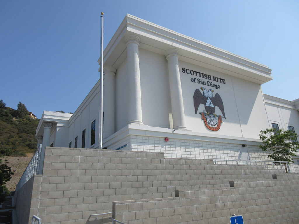
This building misses the mark in every possible way — from the blunt massing and rudimentary detailing to the minimal landscaping and awkward orientation. The ADA entrance, with its tall gray CMU walls, looks like a bunker. The windows are sparse and undersized. The clunky, billboard-sized signage is the coup de grace.
What a colossal missed opportunity to create something special. And the highly visible site adjacent to the 8 freeway assures that this architectural mistake will be hard to ignore. This deserves a batch of undercooked onions.

 Onion
Onion 


